Using flash to make natural light photos might seem counterintuitive to some, and it might drive some natural light photographers a little nuts, but hear me out.
There’s obviously nothing wrong with embracing natural light and natural light only for portrait photos. If the light is there and you can get the look you want from it, go for it. But often times the natural light just can’t quite cut it on its own; at least for some of the looks I want. The looks I’m talking about aren’t necessarily those in which a flash is obviously used; that flash look. I like that look sometimes. It’s a pretty common look nowadays.
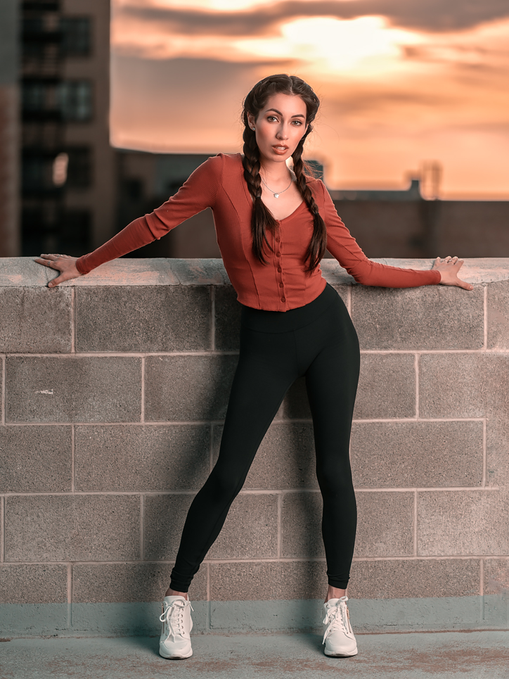
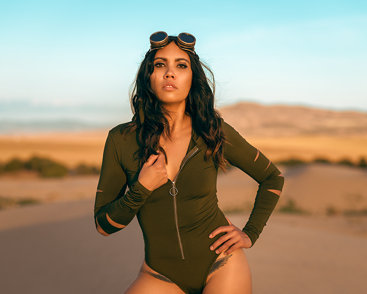
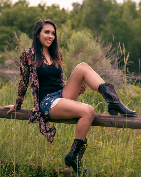
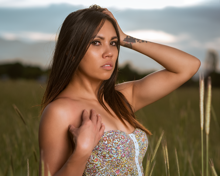
Here’s an example:
To me it’s obvious that a flash was used on this shot. The biggest tell is the fact that it’s shot against a bright background that isn’t completely blown out. In fact it’s shot directly into the sun. That’s the little blown out area you see. But the model, Cindy, is properly exposed. Combined that with the catchlight in the eyes and and the shadows from her legs, yes, this used flash. In fact the use of flash is as subtle as a sledge hammer on the head. That’s ok, though, because it’s exactly the look I wanted.
For this shot I used a 60 inch octa just slightly off axis, camera right.
Remember, light is light. It doesn’t matter where it comes from. Whether it comes from the sun, a lamp, a speedlight, or a strobe, photons are photons. There’s an old joke about using available light, and then pulling out a flash you have with you because it’s available. Yes, cheeky, I know, but it there’s a lot of truth to it.
For many outdoor shots, I tend to use flash even though when I do it’s not obvious. In fact I like to use flash wen when my goal is to create something that is going to look natural.
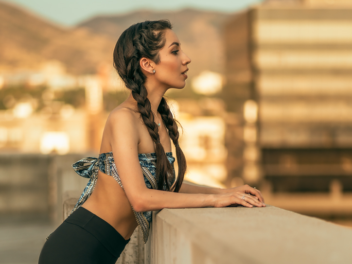
Can you tell if this shot is using flash or not?
I would venture to say that many, if not most, would say this was shot without flash. There are no telltale indications that a flash was used. It looks as if there would have been no need for flash. But when viewed at full resolution, you are able to see a subtle catchlight in the eyes that look like it could be from a soft box of some sort.
But, yes, this shot is done with a flash. I had an assistant hold a speedlight in a 28 inch octa about 45 degrees to the model’s right and about 45 degrees up from eye level. This spot is a little recessed nook off of an alley. Camera left is the alley. Across the alley is a concrete building which provided a huge bit of bounced light coming over the rooftops camera right. But during this shot, the rooftops were blocking direct sunlight. So, we made our own with just a tiny bit of fill.
Yes, I could have bumped up my ISO or slowed down my shutter speed, or opened up my aperture (or all three). But for this shot, I wanted to shoot at f4.5 to make sure that all of Cindy was in focus and just a little fall off on the wall behind her. Also, I wanted to keep my 50mm lense at no more than 1/200. The reason for that is because we were running and gunning around downtown, trying to beat the light. I was huffing a little bit and not entirely steady.
So why worry about it? I just decided to use my available speedlight.
What about this shot?
Natural light or flash?
This shot is a mix of both natural and flash. The sun, almost directly behind the camera, had settled behind buildings thus direct light on Cindy was blocked. I wanted to get the city in the background in a good exposure, but doing so left Cindy darker than I wanted. So I used a 60 inch octa just camera left and just a tiny bit of flash to fill in a bit. It really allowed me to balance Cindy with the background exactly how I intended.
In all of the examples I’ve shown I could have easily gotten photos of Cindy. There’s no doubt about that. But I would not have been able to get the shots I wanted. I would argue that, first shot excepted, I could have gotten what I wanted with a reflector instead of a flash. But, for me, flash is a lot easier because it’s more predictable. I also typically use an assistant on these kinds of shoots which really makes it easy.
Without light, photography doesn’t exist. If you’re a photographer you have to learn to see the light. If you’re not seeing the light, then you’re severely handicapping yourself.
Notice I didn’t say find the light. That goes without saying. But learning how to recognize it, you don’t have to find it. It comes to you. I can’t tell you many times I’ve gone into a session with a specific goal in mind and stumbling upon some light that just caught my eye and I couldn’t simply move on; I needed to take advantage of it.
That’s called seeing the light.
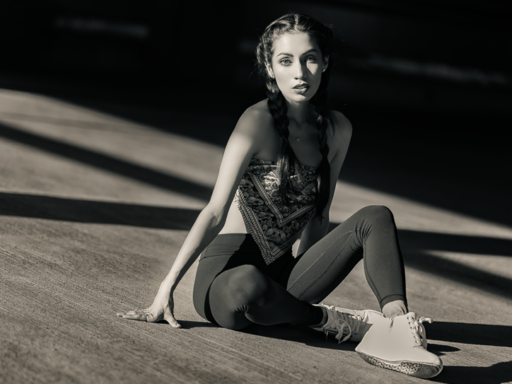
Earlier this summer I was doing an uptown shoot with an amazing model, Cindy. I had an assistant along with us to help with holding a flash. I like having flash because it means that I can find a location and, if need be, mold the light to what I need it to be. We wandered a few square blocks downtown taking shots at various locations. All of this was with the intention of wrapping up the session with a rooftop golden hour location. The intention being to use a strobe to balance the light.
We did do that rooftop location exactly as I intended and envisioned it. But while driving through the garage to the rooftop, I stumbled on some amazing late afternoon light coming in at a low angle into the parking garage. The light was broken up by low walls and huge cement beams which created some amazing shadows. Right away, the whole thing hit me like a sledgehammer.
This is a time and place to get some shots.
Cindy and I parked, jumped out of the truck, and spent about 2 minutes snapping some shots. This is the kind of situation that a good model really pays off. Light like this is fleeting and you don’t want to be racing against rapidly changing light to get the shot.
This is the shot we got:
Model: Cindy, ISO: 125, 85mm, f1.8, 1/800
I love the strong shadows, leading lines, and strong light on her face.
We got a lot of great shots during the session, but this is one of my favorites. It’s one of my favorites because of the light that I simply stumbled across.
Over the past few years of doing the photography thing I’ve really gravitated towards doing a lot of work with models because I’ve found that I love photographing people. From my admittedly limited experience I’ve come up with some tips for both models and photographers that I believe to be useful for me. The key thing here is that this is purely from my personal perspective, and it’s geared toward collaborative shoots for portfolio or personal project endeavors.
Please keep in mind that following is my opinion and how I do things. If it’s not for you, rock on.
MODELS
Don’t practice posing in front of a mirror
Really, don’t do that. It gives you a wildly inaccurate representation because what you’re seeing in the mirror is, well, a mirror image of you. It will never look like what you see in an image of yourself. If you feel you must practice in front of a mirror, instead practice emoting. Sounds weird, but posing is easy. Emoting is hard.
Pose less, move more
Some of the best, most experienced models earn their bread and butter by posing, holding it, camera clicks, they then switch up the pose, hold it, wait for the camera to click … And, frankly, many if not most photographers perpetuate this. It’s not necessarily a bad thing; in fact in many circumstances the pose hold approach may be preferable; lookbooks, catalogs, headshots, etc. Also, I’ve done shoots in which precise and complex lighting was necessary. In those circumstance, yes, pose hold click is great. If you want to get good shots easily, a good model doing the pose and hold approach is great.
With a good model, this approach will guarantee really nice photos if the photographer does their job. But then look at the awesome photos you got, then look at the photos from previous shoots with other photographers. Other than setting, lighting, and wardrobe, they’re likely to be pretty much the same.
And that’s not necessarily a bad thing.
But if you want to get photos that are different and stand out, drift, flow, and move and make the photographer work for the shots by capturing the moments. Instead of looking at it as posing for a photo, approach it as if moving for a film or video. Learn to drift with not only your body and limbs, but with your eyes, face, and emotions too. I’m not talking about flailing around wildly or even mildly. I’m talking subtle drifting with posture, emotion, and eyes. You can tell you’re on the right track when reviewing the images by quickly going through them. It will look like a stop motion film clip.
I’ve worked with some pretty experienced models with whom I’ve spent considerable time getting them to pose less and drift more. It’s uncomfortable for them at first, but once they take a look at the results on the computer the clouds part quickly.
Yes, you get a lot of weird, goofy looking shots, but you also get some amazing and unique shots that you likely would not get otherwise. And with practice, the keepers to duds ratio improves greatly.
Models are horrible at determining what is or is not a good photo
Trust me. It’s true. Models are the worst judges of photos. The reason, I feel, is that they focus on what they believe to be their personal physical disadvantages; things that the average person that looks at them simply doesn’t notice. I think a lot of this comes from models judging themselves based on what they see in the mirror (see above) or in selfies.
The best judge of a photo is, like it or not, the photographer. Sure, if you’re paying good money to a photographer then, yes, pick what you want, but remember, the photographer is way more likely to know which photos are the best.
Don’t pose with your face
What I mean by this is, well, don’t pose with your face. Don’t contort your face to express an emotion (with rare exception). It’s not uncommon for some to twist their face into an emotion. Instead of doing that, try to begin with the emotion, really embrace it, and let the eyes follow as a natural extension. If it begins in the mind, the eyes will follow, and then the face will do what it’s supposed to do. Good actors know this.
No means no
Ideally before committing to a session, both the photographer and the model will have viewed each other’s portfolios and discussed at least generally what each one is after. That being said, it’s not unusual for either one of them during a shoot to suggest something. It’s perfectly okay for that to happen. But if a photographer suggests or asks you to do something that you’re not comfortable with it’s perfectly okay to say, “No, I wouldn’t feel comfortable with that.” And once you’ve expressed that, there should be zero discussion of it after.
And it works both ways. I’ve had models want to do some shots that I particularly wasn’t entirely on board with.
No means no.
Bring someone with you
If you’re doing a shoot with a photographer you’ve never worked with before, absolutely feel free to bring someone with you. There’s no reason that a photographer should have a problem with it. If you want to bring someone with you even if you’ve worked with the photographer many times before, do it.
I’m not talking bringing an entourage with you. No, definitely don’t do that. But, if you like, bring a friend, boyfriend/girlfriend, husband/wife, whatever. If you wouldn’t feel comfortable otherwise and the photographer balks, tell them to pound sand.
Sorry, photographers, but I feel strongly about this.
PHOTOGRAPHERS
Don’t take artistic advice from other photographers
Other photographers are the worst people from which to receive artistic feedback from. Do yourself a favor and do not seek artistic advice from other photographers. Sure, other photographers are great to learn technical aspects from; settings, lenses, getting your head around the use of flash, etc. But throwing your photos out there and asking for the opinions of other photographers is a nightmare scenario.
The reason I say this is because of the plethora of online places such as the forums at places like DPReview. If you go to, say, their Portrait and People Photography forum you’ll witness some of the most absurd nonsense you’re likely to see; much of it unsolicited in response to photos that people put up. I think much of the nonsense is because of the nature of an online world and how it has magnified human nature. Human nature, whether we like it or not, is to hear someone spout something with authority and then accept it without thinking about it. Examples of this are: don’t crop off the tops of heads. Don’t crop off the tips of fingers or feet. Don’t crop at the joints of limbs. Any hint of perspective distortion is bad. Catchlights other than round ones are bad. 2 to 1 lighting ratios are optimal, too shallow DOF, on and on. In other words if you push the boundaries at all and go against the “portraiture orthodoxy” they’ll pound you down until you conform if you let them.
I’ve seen new people start throwing up photos on that forum, make adjustments per the orthodoxy, and a year later they’re throwing up technically nice photos that are exact replicas of your average yearbook photo or something that was made in one of those family photo shops you used to see at the shopping mall. If that’s what you want, good. But if you want something that has just a slightly unique flavor to it, good luck. You’re just the next vanilla flavor sitting next the other vanilla flavors.
Do observe the work of other photographers
Within reason. The world is full of some truly great photographers. But don’t view the work of other photographers with the intent to necessarily copy what they’re doing. Instead, try to figure out what it is about their work or a particular photo that you like. Why do you like it? What is it about it that got your attention? Use the work of others as an inspiration.
I find that as time passes, I do this less and less. But I always enjoy looking at the work of others. There are a lot of talented people out there.
Learn from other photographers
There are a lot of great photographers out there. There’s something to be learned from almost any photographer. I love watching others work, how they deal with lighting, or how they work with models, or how they post process; whatever it is. If I’m ever invited to come and participate in any way by another photographer, I try to take them up on it because I almost always learn something.
Your way isn’t the only way.
Start creating a mood/vibe board
Remember, I’m directing this mainly towards people photographers. Start building a mood/vibe board of images that present various moods/vibes that you admire. You can do this with either an online tool like Pinterest or DropBox, etc., or locally on your own hard drive.
Personally, I prefer to use an online tool. The reason for this is because if I’m setting up a shoot or working with someone in creating a project, I like to send them a link to my extensive mood/vibe board so that they can pick out shots that represent a mood/vibe that appeals to them. It’s not to copy something, but to use it as inspiration. It also helps you to better understand where the model is coming from. It can save so much time.
I’m constantly adding to mine. It’s a never ending process. It includes photos from various photographers, including me.
Learn to use artificial lighting
Even if you’re a “natural light” photographer. The reason is that light is light; whether it’s natural or artificial. If you learn artificial lighting, it will translate into better understanding and use of natural light.
Practice more with natural light
This is directed at photographers who mainly use artificial light for the same reasons. Getting better at natural light will make you a better artificial light photographer.
Shoot tethered whenever possible
I know it may not be possible all of the time, especially when shooting on location or outdoors. But whenever possible, I highly encourage photographers to shoot tethered to a computer and encourage models to view what’s coming out. If you can’t shoot tethered, at least show them the back of the camera often.
Don’t be afraid to show unedited photos
This is related to shoot tethered whenever possible. I have personally spoken with photographers who will not let people see unedited photos. Because of this they will either not shoot tethered or, if they do, they won’t let people see the images on the computer. Don’t be that person. The reasoning for some is that they don’t want others to see images until they’re finished. They insist on only showing their “vision.”
Ugh.
If you can’t get it mostly there in camera, then you’re doing something wrong. Even if your “final vision” is a complex composite, show what’s happening to the model while taking photos. I know a photographer who specializes in complex composites. The guy is amazing. I’ve watched him work with models and he has no problem with showing them the back of the camera during the shoot. Even though what they’re seeing is not even close to what the final result will be, they still look great because he knows what he’s doing.
To take it a step further, after a shoot I encourage models to sit down with the laptop full of all of the unedited images we just shot and go through them and pick out ones they like the best.
If you’re not comfortable with showing people your unedited photos, work on your skills until you are.
Encourage models to bring someone with them
This is a big one for me. I always invite models to bring someone with them; especially if it’s a first shoot. Surprisingly, few do. But I always make sure that they know they are welcomed to. I know quite a few photographers who discourage it for various reasons.
I don’t get it.
For me, I want the models to be as comfortable as possible. If they’re comfortable, you’ll get better photos.
Plus it’s the respectful thing to do. Trust me, you’ll get better pics, too.
I’ve had husbands/boyfriends or friends at implied shoots that come along and I’ve never had a problem with it. In fact it can be kind of funny when they pull out their phone and take a behind the scenes photo of me working with their half naked wife or girlfriend.
Behind the scenes with Analiza studio shoot.
I normally wouldn’t get as close as I am in the photo above, but we’re good friends and it’s still strictly business. When her boyfriend took the photo he chuckled and said something like, “Dude, it’s like you guys are in the office, or something.”
Here’s one of the final shots from the session:
Analiza studio session final result.
No matter what kind of shoot it is, it’s okay for them to have someone with them.
Behind the scenes with Angie photo shoot.
One of the final shots from the session above.
Angie studio final result
Be nice, be considerate
Modeling is difficult. Don’t forget that you’re dealing with a human. Get to know them. Talk with them. Make them feel comfortable. Understand that it’s a mutual collaboration. Make it worth their while to be doing this. Go above and beyond. Be accommodating.
This will mean talking while shooting. You can’t take on a truly mutually collaborative spirit without talking with the model and communicating with them while shooting. Always encourage. Never degrade. Make the shoot all about the model. I really mean that.
Also, the world is full of awesome people. This is a chance to meet and get to know some. I’ve never had a shoot after which I didn’t feel good about meeting and getting to know that person a little bit.
Don’t be creepy
I debated on whether to have this at the beginning or at the end because it’s so important.
I mean it.
Don’t be creepy. Don’t make crude or rude remarks. Don’t reference body parts in a sexual manner. Don’t leer, Don’t do anything that can be construed in any way other than strictly professional.
Some kinds of shoots really require good judgement and a lot of respect. Turn away if need be. Ask if they’re ready for you to turn around. Have a robe at hand and when not taking photos, offer it. If there’s a “slip” politely let them know.
The old adage of, “never touch the model” is a good one. If I’m doing an implied style of shoot, I try to keep my distance as much as possible. There are a couple of models that I’ve worked with numerous times and we’ve become good friends. We’ve developed good relationships. They are okay with me moving a couple of strands of hair, or something like that. But it’s the exception. And even then I always ask.
Reputation is everything. Don’t do ANYTHING to jeopardize it.
That can go for assistants, too.
In fact I’d love to be able to find a good female assistant. But that’s a whole other topic.
There you go. That’s it. Again, this is just my opinion and what has worked well for me.
A lot of people may think to convert color photos to black and white using Photoshop that it’s as simple as sucking away all of the saturation. But it’s not that simple. At least not for me and what I like. You may like something else, but for me, an effective black and white conversion needs to be stylized to some degree. After all, by simply going the black and white route we’ve comfortably eschewed the realistic.
With few exceptions we all see the world in color.
This photo originally began with the intention of it being color. That’s what I had in mind when I first set out to make it. Here is the original version after post processing:
Original color processed image.
I like it. It is what I originally had in mind; a sort of festival style fashion thing out in some rolling sand dunes. I like the colors and I love the skin tones of Analiza, the model, and how they tie in to the surrounding environment.
Then I thought about how it would look in black and white. The more I thought about it, the more I felt it could look great. But I knew it couldn’t just be a matter of simply converting the image to grayscale or dropping the saturation all the way to zero which results in an image like this:
Example of image completely desaturated.
To be honest, it’s not bad, but I don’t think it really pops. By that I mean there’s nothing really different about it other than it’s simply been desaturated to black and white.
Keep in mind that I’m not claiming this is the best way to convert images to black and white. There are a ton of ways of doing it and there are third party plug-in, too. This is just my way.
To convert the color image to black and white like I wanted, the first thing I did in Photoshop was to add a Black, White Gradient Map adjustment layer. That resulted in a look similar to the simple desaturation above, but with a bit more contrast. Next I added a Levels adjustment and moved the right adjustment slider inward just a tiny bit to open up the image a bit; take away some of the contrast. I did this because I wanted to pop the model a bit.
But the above step with the Levels adjustment brighted everything up a bit which I don’t really want. So I added a Curves layer and brought the middle of the curve down a bit to darken everything. I then painted out the adjustment over the model with a large soft brush (softest brush available) and a flow of 1%. I’m not too careful with this, I just paint over her and let it vignette out a bit. I then did Image > Apply Image, and checked the Invert box to better blend the mask.
Next I added a couple of curves layers to dodge and burn some highlights and shadows on the model to give her a bit more contrast. Again, I applied these with the softest brush available at a 1% flow. After this step, the bulk of the conversion is finished. But there’s still a few steps to just tweak it to what I like.
I created a new layer with a soft light blending mode and 50% gray: Layer > New > Layer > Mode Soft Light > check the box, Fill with soft light natural color. Again I used the softest brush and set to a flow of 1% I painted white into the highlights in her hair just a bit and painted over her face to pop it a bit. I also painted black over her lips and eyebrows to darken them a bit and to add a bit of contrast.
I then added a Photo Filter adjustment layer, using Warming Filter (85) with a density of 15%. It’s very subtle but it adds just a tiny bit of warmth. Trust me, it’s very subtle, but makes a lot of difference aesthetically. Technically, at this point, it’s no longer a “black and white” image, but for all intents and purposes, it is. I like it.
The next step was to add a vignette. To do this I used the Elliptical Marquee tool to make a selection around the model. I then added a Curves layer, pulled down the middle of the curve to darken the image, and then inverted the mask. Next I then added a Gaussian Blur on the mask to blur the transition. I blurred it a lot. For this image it was a radius of 792.7. I moved the mask around a bit to set it where I liked it best; Ctrl + T > click and drag.
The final step is something that I do often with black and white images. I add just a tiny bit of noise because I feel that it gives it a more film-like look and it just ties everything together. I do this by creating a new layer and then Filter > Noise > Add Noise. For this image I set it the amount to 2% Gaussian and checked the Monochromatic box.
Watching some of the discussions over at the blithering pedantic nonsensical mess that is the DPReview forums is enough to make reasonable people’s heads explode regarding camera brands and their respective “color science” and how it affects photographers. Generally, how one brand handles its colors vs another is the last thing you should be thinking about. With few exceptions, camera brand color science doesn’t matter.
First off, “color science” doesn’t mean squat to the average photographer. Color science is a real science and it’s mostly relevant only for engineers that are developing systems to deal with colors (in a nutshell). When the average photographer goes on about “color science” they’re not really talking about color science. They’re probably talking about color theory. They are two different things all together.
Then you get people talking about how brand X’s “color science” is better than brand Y’s. Or how people prefer one brand’s handling of color over another. Looking at the DPReview forums you’ll see people go on and on and on ….. And on about it.
But it’s mostly bullshit.
For a pretty good rundown on camera color science and why camera brand color science doesn’t matter, this video is pretty good:
In fact the only time that it might matter is if you’re shooting JPEG only and you don’t post process your photos. Then you’re going to see different brands produce slightly different looking colors. But even then it’s not really a big deal. However, if you shoot raw and you post process your files it doesn’t matter at all.
Period. End. Of. Story.
The reason it doesn’t matter at all in this circumstance is because people generally post process their images to their personal tastes and what looks most pleasing to them. You can take different photos by different cameras (in raw) and simply setting a white balance will remove almost any perceptible differences. To further add to consistency you could create a profile for each camera with something like an X-Rite ColorChecker and it will remove any perceptible difference. I guarantee that if you have three different brands of cameras and profile them, then post process them to your tastes you will not see any perceptible difference in the colors.
Anyone who claims they can look at processed raw files from profiled cameras and see a difference are simply full of shit.
Period. End. Of. Story.
That’s why when you look at photos by famous photographers who have changed brands of cameras you’re not going to suddenly see that their photos look any different. It’s because they generally post process their images to their taste and what they like.
So, at the end of the day if you shoot raw and post process your images to your taste concerning yourself over a brand’s particular “color science” is the last thing you should worry about.
Finding models to photograph is difficult. But asking strangers to be your model is a valid approach. Sure, you can hit up an agency I suppose, but for hobbyists like me it can be an expensive thing. You can also peruse sites like Model Mayhem. Technically using Model Mayhem is asking strangers to be your model, but that comes with it’s own hurdles.
One of the biggest issues with finding models to photograph on Model Mayhem is that the majority of models on that site are just difficult to pin down. That’s a polite way of saying they are flaky. I mean real flaky, typically. Instagram can be similar.
But asking strangers to be your model who you come across in everyday life is a valid option. The real problem with this approach, however, is that it’s so easy to be taken the wrong way, thus it’s important to use the right verbiage. I’m not certain what the right verbiage is, but I do have a good idea of what I feel is the wrong verbiage. For example, walking up to someone and blurting out something like, “hey would you like to model for me?” would definitely be awful.
Don’t do that.
Really. Don’t do that.
As an example of how I’ve asked a stranger to be my model, one time I asked someone working in a store that I regularly shopped at if they would be interested in doing a shot for my 100 Strangers Project. She agreed and then as we talked a bit more and I explained what I do, she expressed an interest in doing a full blown session. It worked out well. In fact participating in the 100 Strangers project has helped me immensely with approaching people.
Most recently, a couple of months ago I was in another store returning something. The girl behind the counter who was processing my return was very interesting looking. I visited with her as she processed the return and then when she was done, I handed her a card and explained that I’m a photographer and asked if she would be interested in doing a casual shoot sometime. Right away she was interested. I didn’t try to get a commitment or anything like that at that time. I just handed her my card that has a link to my main portfolio page so that she could, “get an idea of what I do.” At no time did I use the word “model.”
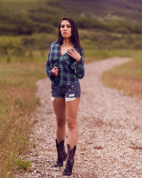
I think it was later that day that she reached out to me to set up a time. As it turns out, she has some experience doing the modeling thing, and had an Instagram page to show for it. After looking at her Instagram page I almost immediately formulated an idea of what I wanted to do. It was going to be something vastly different than what she was currently showing. I had a location in mind and I wanted it to be a kind of rural, country-ish, saucy cowgirl thing as the primary look, plus a more flowing dress or something with a sundress, too. And I was wanting to do both off camera flash and natural golden hour shots as well.
So I met up with her, along with an assistant and my photo gear at one of my favorite places in the valley to shoot, Dimple Dell Park. One of the things that I like about Dimple Dell Park–heads up for local photographers–is that it’s almost always calm. On this day it was extremely windy all over the valley. I’m talking way too windy to even think about using a light with a modifier; even with an assistant. But here at the park it was almost completely calm. It must be the geographical nature of where it’s located; kind of down in a little basin.
It did take a few minutes for it all to start gelling–something that’s pretty common–but after a while she really started getting into a cool little groove.
First shot, using off camera flash to kill the ambient.
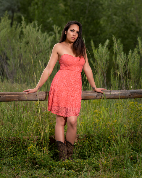
One of the first shots above.
I’ve found that when it comes to inexperienced models it’s always good to start them off leaning against or sitting on something. This fence was perfect. In fact with any model, no matter the experience level, I’ve found leaning against something is a great way to get started.
This shot is pretty good. She’s a great looking and her skin is just perfect.
But I always have a goal of making things light if possible. This next one below is when things started to loosen up a bit. After a quick change of clothes and more fence-sitting, I could see she was getting pretty comfortable with the crack of a smile. A little goofing around is a good thing.
A couple of shots in and Analiza started to relax.
I moved my light around, found the sky in the frame. I exposed for the sky and used the flash to fill in Analiza. I love these kinds of shots; mixing ambient with flash.
I set exposure for the sky and used flash to fill in the model.
And then we started getting down to business. One thing that I’ve found that I can’t stress enough is to show the model some results on the back of the camera regularly and often. It really helps when they can see what’s being produced. They also get an idea of what we’re all going for. I show them about every third shot or so. Show them what’s going on and use it to explain what I’d like to see.
Now, we’re beginning to get someplace:
Again, off camera flash.
Soon we did a change of clothes and moved to another location in the park.
Country Girl.
Thus far for all the shots I used an XPLOR 600PRO with a 38″ deep parabolic soft box. On the shot above I had an assistant hold up a large scrim camera left to negate some of the wildly changing lighting from clouds blowing by.
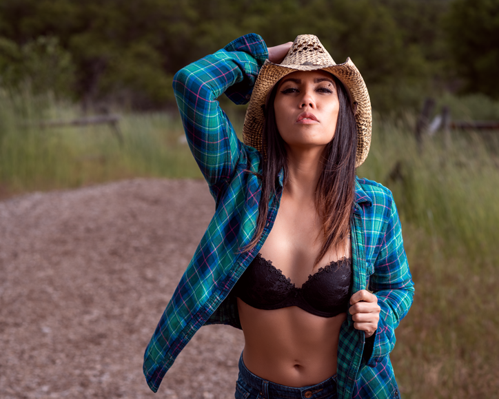
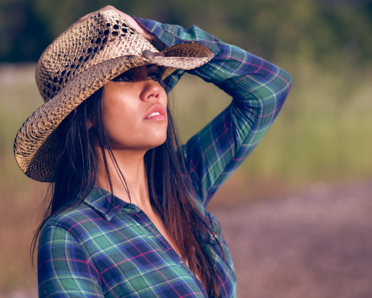
Earlier in the week I bought a funky looking cowboy hat for cheap. I gave it to Analiza and she rocked it quite well:
Cowgirl chic. Again, off camera flash to kill the ambient a bit.
When you start wearing otherwise goofy looking cowboy hats and rocking an open shirt, one thing that is key as a model is to not hold back. The line between silly and cool is a thin one, and in order to pull it off I tell models they have to own it, flaunt it, and be absolutely unapologetic about it. It makes all the difference in the world. Plus, it helps with engagement. In the shot above, she almost looks like she’s challenging anyone looking at the pic. You got a problem?!
The following shot is pure natural light. The golden hour was perfect:
Natural light golden hour.
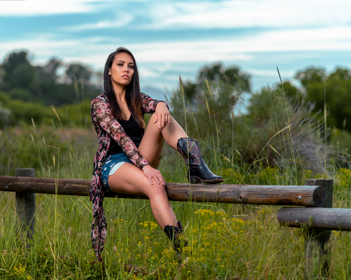
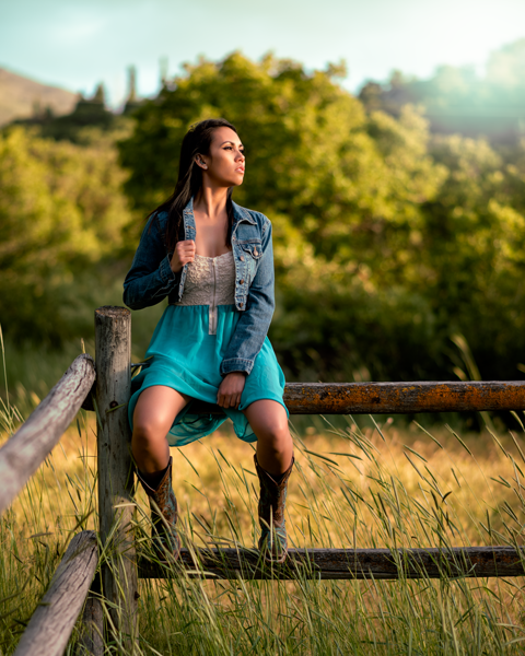
And the following shot was a mix of ambient and off camera flash. The sun was low enough that I thought it would look better with a kiss of flash. I used the XPLOR 600PRO camera right with a Glow 70 degree Magnum reflector. That thing is a beast. I set it up about 15 feet away camera right:
Analiza on the fence.
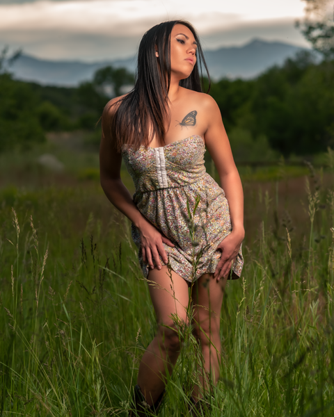
We actually ended up coming back to the park a few days later to get in some looks with a sundress that we were not able to fit in on this shot. The following photos are from that visit:
Dancing in a sundress
So, there you have it. I met a young woman at a store, asked if she would be interested in doing a photoshoot sometime, and these are the results. I think she did amazing and it was a lot of fun for both of us. We’ve since done another shoot that also turned out well. I’ll put up a post about that shoot soon.
Had it not been for me asking a stranger to be my model, none of this would have happened. So ask yourself, what are you waiting for?
One has to wonder how a technical issue could result in a page offering something that was never before available while at the same time removing some that has always been available could occur, but hey, I suppose it could happen.
Personally I tend to agree with Adobe’s official statement; it was a test. I also feel that there was sufficient blowback that they thought the better of it. CSR reps don’t just spew out a line relating to something as huge as this without it being passed down.
Generally, that is.
Here’s the deal. Adobe is a huge corporation who at the end of the day owes their allegiance to their shareholders. Love it or hate it, that is the reality. Their existence is solely predicated on the basis of making money for shareholders. Period. End. Of. Story. I don’t have a problem with that. That’s how capitalism works. If not for that concept, there would be no Lightroom and Photoshop. We’d all be stuck with Giimp or some other nonsensical freeware. But all of that being said, Adobe needs to walk a fine line. They have undoubtedly increased profits since the advent of the subscription model; a model that I personally love. But if they bump it to $20 a month they will lose a lot of people. Their pitch seems to be that with the $20 you’ll get 1TB of cloud storage instead of the 20GB that currently comes with the $10 plan.
So what. Personally, I couldn’t care less about a single KB of cloud storage that Adobe might offer. The way I look at it, Adobe is a company that makes its bread and butter mostly as a developer of applications for creatives, not selling storage space in the cloud. As a photographer, the only thing from Adobe that I care about is Lightroom and Photoshop. If they start charging $20 per month for me to use Lightroom and Photoshop I’ll probably need to reassess my relationship with Adobe. No, I might not bail right away, but I’ll definitely start laying the groundwork for as easy and painless of an exit as possible.
Trust me, Adobe. You don’t want that. No, Adobe doesn’t care about what I will do, but I think that I represent a huge segment of their user base; enthusiast/professional users. After all, for photographers, Lightroom and Photoshop are the industry standard and contrary what many like to pretend, these are absolutely the best overall tools available for many reasons. Yes, there are other options out their, but they pale in comparison. The workflow possible with Lightroom and Photoshop is difficult to replicate in any other ecosystem.
But that’s changing. As I write this there have been a number of other vendors who are starting to become competitive. I am confident that within 5 years there will be fully competitive alternatives available.
What else am I confident of? Within 5 years you’ll be hard pressed to find any meaningful alternative that isn’t a subscription model.
Way back in April of last year I wrote this post on the best way to upload images to Facebook. For a long time the method worked great. Then Facebook, being the moving target they are, changed it so that the method resulted in horribly fubared images. Trying to go back to uploading images the old way which was basically resizing them to, say, 2048px on the long side if in landscape or, if in portrait, 960px and then saving as JPEG with the sRGB color profile embedded also resulted in just horrible compression artifacts from Facebook.
This was in December of 2018 when it all went to the crapper. At that time, after much experimenting I found out that the best way to upload images to Facebook was this method, which was basically just uploading a full size and full resolution image; making sure to not optimize it in any way. It seemed that by doing so minimized the damage done by Facebook’s compression algorithm; by optimizing the image before uploading it, it essentially got hit twice, once by you, once by Facebook.
I think.
But, either way, it resulted in the best image quality, nearly equal to that of the first method.
Well, it now seems that Facebook has tweaked their algorithm once again. Now it seems that the best way to upload images to Facebook is, again, resizing them to either 2048px on the long side or 960 on the top/bottom if in portrait mode.
Oy, Facebook.
Originally, uploading them in PNG, i think resulted in them not being compressed at all because the algorithm seemed to only concern itself with JPEGs, but I don’t know if that’s the case.
So, at the end of the day, for best quality, it’s probably best to use the method I wrote about originally. That method is capped by saving them in PNG while preserving details. The reason I think this will work the best is because PNG is a lossless format when saving. Yes, they are converted to JPEG by Facebook, but they are only hit the one time rather than the twice it would be if you save them to JPEG before uploading them.
Yes, DP Review discussion forums suck. It’s not really surprising in and of itself because most online forums suck; it’s just the nature of the internet I suppose. The reason most online forums suck is because of crappy moderation.
But this is a photography blog, what gives with this disrespect for online forums? Well, as you probably know, DP Review is digital photography gear news and review site. It generally has pretty good information. Their online forums, like all online forums, are mostly crap, but there can be some very useful information to be had in some of them. The most useful for me were the forums on lighting, retouching, and portraiture. Each one of those forums has a small number of regular participants that are truly experts in their given field, and they demonstrated it often by example.
But somewhere along the line DP Review apparently took it upon themselves to crack down on uncivil behavior; perhaps they passed word down to their mods, who knows. Combined with huge page long rules for each forum along with mods who may or may not have reasonable notions of what “civil” is and it’s pretty much guaranteed that DP Review’s discussion forums are going to fall into a deep suck hole.
Anyway, the DP Review discussion forums have now largely lost their appeal and usefulness.
In my opinion here’s how DP Review (and all online forums) can become tolerable, and more importantly more useful . It’s very simple, really. Outside of stalking, doxxing, personal threats, and off topic responses, anything should pretty much go.
In other words, treat people like adults and don’t try to police civility. Just let people easily block those they don’t want to interact with. That way, the system will take care of itself.
This is a look at a behind the scenes glamor session in a small home studio.
I’ve been wanting to do some kind of full on glamor stuff for a while, now, but I haven’t really had the means to do it. When I say means I’m talking about the talent needed beyond any skills I may have as a photographer. If you’re having trouble wrapping your head around what I’m talking about, I’m talking about a good hair stylist and a good makeup artist. For the kinds of shots I had in mind I felt that I could get away without a wardrobe person, but as far as hair and makeup, no way. Not if I wanted to do it right. Not to mention a good model or models.
I have a friend, Kasey, from a martial arts gym that I frequent who I knew does hair and makeup professionally, and I’ve been talking with her over the past few months about what I was wanting to do. She was on board, but it just seemed that I could never get a model lined up. I have a couple of really good model friends, but it was just hard to get them nailed down.
One day at the martial arts gym I met Angie who was a new student. Right away I thought she would make a great subject for my 100 Strangers Project, so I hit her up about it. She was really open to the idea, but she went on to say that she was a model that was represented by an agency.
Go figure.
We got to talking and I showed her some of my work and she flat out said that she would like to do something with me. I then told her about my idea and Kasey the HMUA who was also a member of the gym, and it all just started falling into place.
Side note: Don’t be afraid to approach people you want to photograph.
Anyway, we created a shared Pintrist board for ideas and went from there.
Over the next few days I worked it out with Kasey the HMUA and she said she had a friend who was a great hair stylist who she thought would like to get in on it as well.
Hell, yeah. So, we set up a date with Angie the model, Kasey the MUA, and Paul the hair stylist.
I had already set the notion that I really wanted to do a full on head and shoulders glam type of thing as a priority and then do something else as a secondary thing; a couple different looks, one standard glam and one using a masquerade type of mask. Angie was really on board with that and had shown me a bunch of ideas on the Pintrist board.
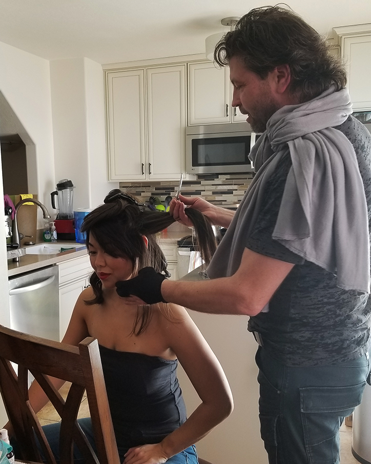
On a Sunday morning Angie stopped by the house with a suitcase full of clothes and a couple of cool looking masks. After a cup of coffee, Paul and Kasey showed up and they started working on Angie in my kitchen (yeah, home studio guy here).
Hairstylist Paul Chance and Angie Tani
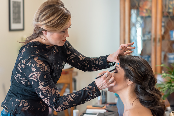
After Paul got done doing his thing Kasey went to work.
Makeup artist, Kasey Kasai
After we got everything down it to the studio. I don’t have a large studio, but I’ve managed to make it work.
My plan from the beginning was to use a pretty simple light setup; an on axis 38 inch deep parabolic fairly close and at about a 45 degree downward angle with a reflector about chest high to bounce a little fill.
Equipment:
1 Flashpoint XPLOR 600PRO
38″ Glow EZ Lock Deep Parabolic Softbox
1 Lastolite 30″ reflector
I used gray seemless paper as a backdrop and flagged either side with a couple of black V-flats to contain the light as much as possible. It resulted in a kind of nook. It worked pretty well.
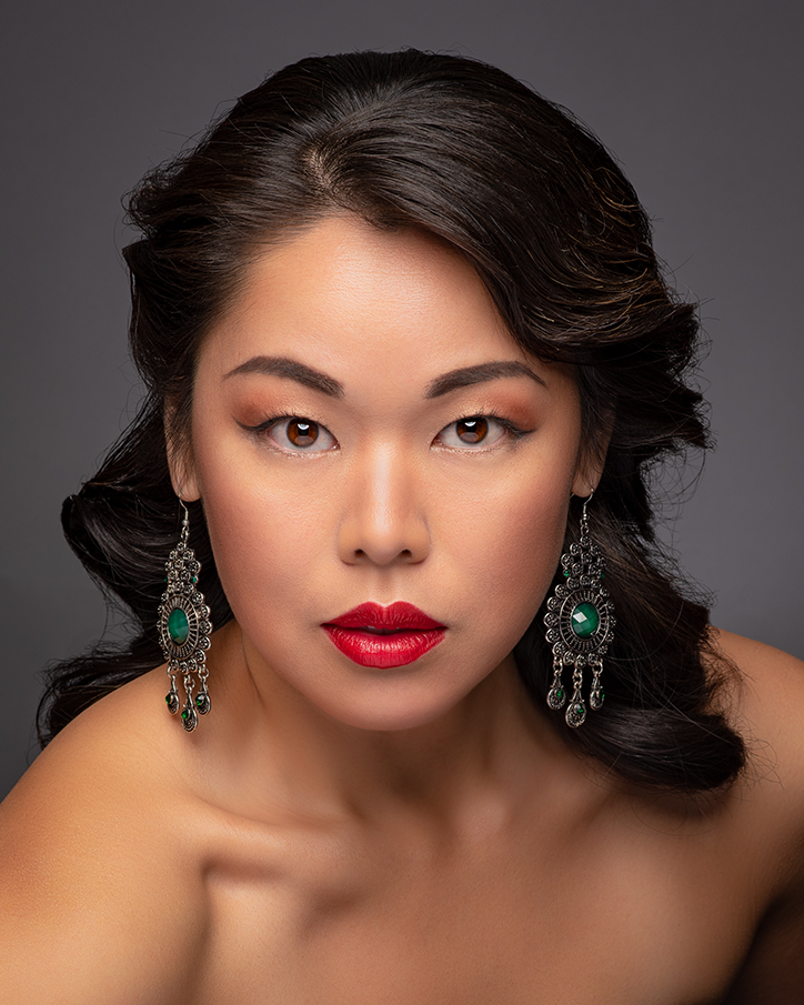
Here are some of the resulting shots:
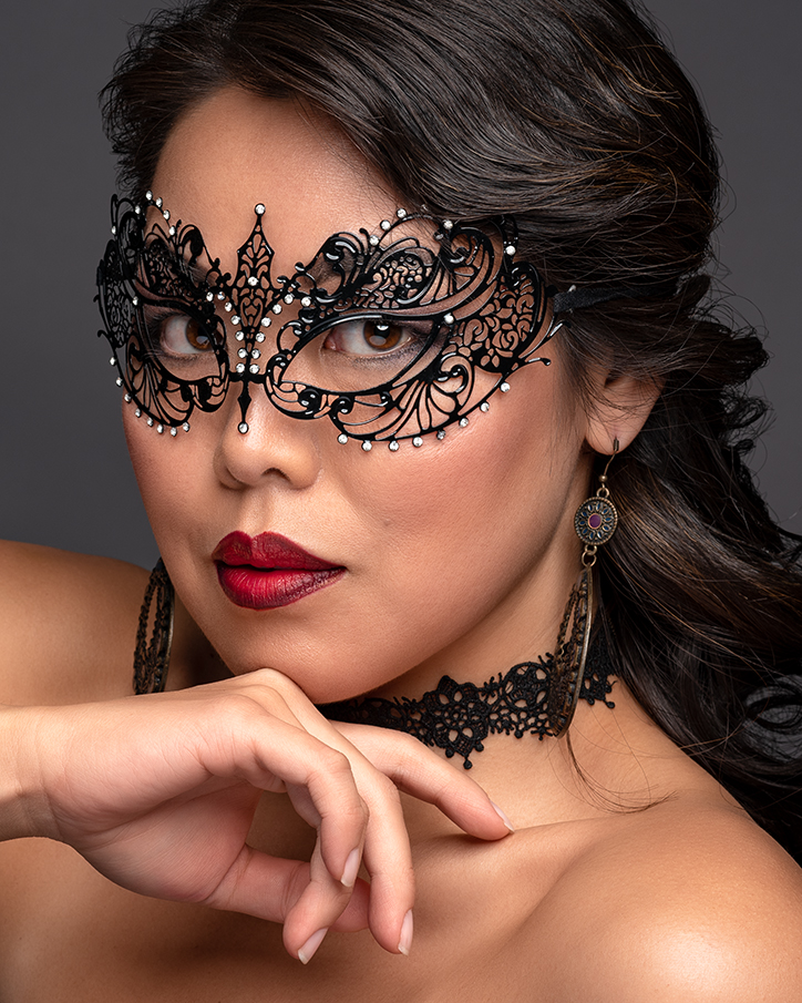
Angie Head and Shoulders. ISO 100, 85mm, f11, 1/200Angie With Mask ISO 100, 85mm, f11, 1/200
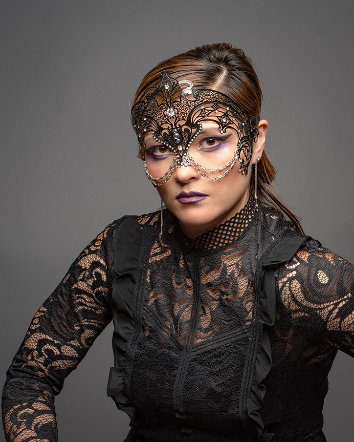
Kasey got in on the mask action, too. On this shot no bottom reflector, just the softbox nearly on axis.
Kasey With Mask ISO 100, 50mm, f11, 1/200
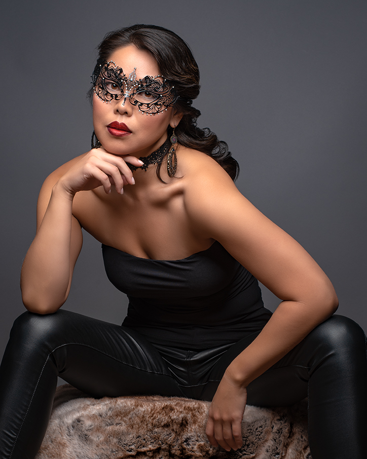
And finally this other one of Angie. Like the above shot, this too without a bottom reflector and just the softbox nearly on axis.
Angie Cool ISO 100, 50mm, f11, 1/200
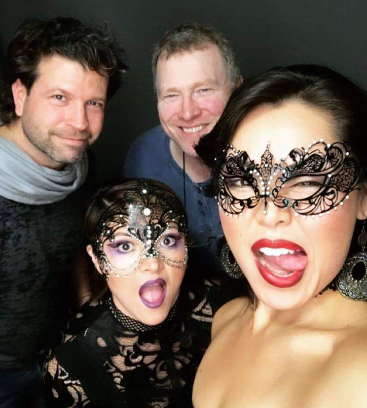
All in all I’m pretty happy with these shots. I got a lot of good ones and Angie got a couple of ones that she handed off to her agency for their website.
At the end of the day it was a great experience. We all had a lot of fun and I learned a ton. Angie and I have already started working on some ideas for the summer; editorial style fashion experiments, and a little project I’ve been wanting to do for some time.
And, of course, the obligatory goofing around selfie!